The Meaning in the Logo
We definitely haven’t been keeping our new logos to ourselves, have we?
Our logo was really the most important piece for us. Aside from our relationships, designs, and reputation, we needed a logo that we could stand behind — to represent us, and who we are.
Because of that, the first step in the process of rebranding was to create a FABULOUS logo. We knew that once we had that, everything else would follow, seamlessly reflecting the brand.
I mean, if you’re going to transform into something else, you kind of need to have a clear idea of what and who, right?
Fortunately, we found someone who guided us through that process, encouraging us to reflect on our purpose, our why, our goals, and how we wanted to connect with others. Thank you to Joint & Marrow for pouring so much thought, heart, and time into our logo. You didn’t just help us create a ‘brand’. It’s way more personal than that! You helped us put a face on our heart and soul, and for that we are eternally grateful.
Some Background on our New Logo:
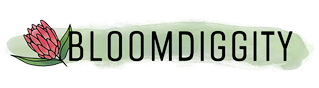
Main Image: Protea Blossoms
We have always adored Proteas and how simply bad ass they are as a flower. But beyond their incredible visual presence, proteas symbolize courage, transformation, daring, and diversity. Concepts we keep close to us for inspiration, as well as guide posts for all we do in our personal lives, and in BLOOMdiggity.
Primary Colour: Green
Seems like a fairly natural choice for a florist. But again, also full of meaning.
I’ve had a personal draw to the colour green for a few years now. I feel at home in it, safe & secure. So I wanted to bring that in to the logo. Green means rejuvenation, growth, abundance, healing. We know it as the permission to proceed (“go”), which is indicative of forward motion. All of these words and their definitions were elements we touched upon as a team back in one of our early concept meetings before the rebranding occurred.
Style of Design:
Dustin from Joint & Marrow hand drew the logo for us. Although I am a big fan of realism, I didn’t want a complete and perfect rendition of the flower (although, let’s face it, Dustin is incredibly talented and our logo IS perfect by our standards!). I wanted a slightly incomplete look, as if you stumbled upon a creative process still underway.
Why? We wanted to reflect the artistic process that goes in to floral design. Flowers are literally our canvas, palette, and paint. And we put a little bit of ourselves into each creation. When we design, we bring to mind and heart how it feels to lose someone, to love someone, to want to see someone succeed, to feel regret & sorrow for hurting someone we care about. Whatever the occasion is, we draw from its meaning in order to create that custom design. It is a labour of love, empathy, and interpretation.
Font:
Let’s face it! We chose a rather interesting name to identify as. That’s because we like to have fun! And laugh. And enjoy the quirks that life has to offer. We wanted something fun and different to share with the world. But, we are also professionals.
As florists, we value our skills, knowledge, and passion, and we want our clients to identify with that side of us, also. We want them to understand that even when we are pushing the boundaries of traditional design (and most likely poking some fun at it). We have very architectural elements in our designs; it’s not just putting pretty colours together… It’s paying homage to the natural tendencies a flower already has, the way it moves and flows. We want it to remain itself even within a crowd. The flowers personalities play a huge role in how we design.
Our font selection reflects the professionalism, the modern and architectural elements, the solid foundations of our training… But it also acknowledges the softer side where we like to have fun, how we learn from nature’s fluidity, and are little less prone to adhering to ‘normal’ standards.
So, as we said! A lot of care and thought went in to the creation of our new logo.
We will aim to live up to all we put in to it, every day. And we are so honored to share it with you.